meta name="p:domain_verify" content="83432fc69a1d6df071f49df584f9d839 Laurl Designs: french grey
Showing posts with label french grey. Show all posts

Monday, May 25, 2015

Historic Preservation- a tour at the newest project at The University of Montevallo


I am working on a historic house project, at the University of Montevallo. Montevallo is a lovely town filled with houses from many eras starting with pre-civil war through to a delish modern house with glass walls.
The King House is a pre-civil war house dates to 1840’s and was the first house in Shelby County to have glass windows. The style of the house is called an I-house with two rooms downstairs and three rooms upstairs. The kitchen is detached, as is typical in houses of this vintage. It keeps the house cool and can aid in preventing fires in the house.
©LaurlDesigns
My focus on this project so far has been the living room and the fireplaces. The living room needed an update with more modern fabrics to give it a home-y bed and breakfast feel, while keeping the classical style in the furnishings. We choose a soothing french grey and aqua palette that complimented the wood tones in the house and the french grey woodwork.
 ©LaurlDesigns
 ©LaurlDesigns
 ©LaurlDesigns

©LaurlDesigns
 ©LaurlDesigns

The fireplaces, which are not working, were updated with unglazed porcelain logs. The logs nodded to the use of the fireplace with the white porcelain nodding to the "unconventional" art school reputation of the school. 

Next on the list of updates for this project is the rugs, and upstairs soft furniture!

Saturday, April 19, 2014

Inspiration- Neutral dining room

Today's design board is a nod to the neutral color palette lovers. Neutrals are a great way to play with pattern and built a hierarchy with scale and theme. Hierarchy, you say? Yes! Just like a diagrammed sentence, Manslow's hierarchy of need, or a Venn diagram, there is a visual hierarchy in place in all rooms. Building this hierarchy with patterns, colors, size, scale, texture, or a mix is what makes a room great. When you eliminate some of these options, like color, or pattern, it is easier to see the built environment's hierarchy.

For this space, I added one color that is different from the rest- a green buffet. It is the top of the hierarchy, because you see it first. It is the lead singer in the band. The next is the arabesque wall paper, it is the most graphic (greatest contrast in tones close together) pattern and it is the tallest and biggest item in the room. The hutch is the tallest furniture in the room and breaks up the wallpaper, which would be overwhelming with out the visual breaks of the hutch and the art. The art provides a place for your eye to rest from all the pattern. It ranks third. Lastly, are the table and chairs, they are why you are in the room. You are naturally going to gravitate to them and you will physically interact with them, so there is less reason, design-wise, to make them the star.

Laurl Designs boards can be found here.
Another hierarchy to think about is the senses. You see the space first, let your first sense get the top billing for all the reasons listed above. Then, you hear the space. Is it loud or quiet? Carpets on the floor, drapes and other textures change the noise level in a room. Fine dining has carpets, texture wallpaper, tablecloths and sometimes draped interior spaces. They are very quiet. In fast food places, there are no soft fabrics... I'm not counting the dust mats at the doors. You want your space to sound like fine dining, not McDonald's or like McDonald's, you will be leaving the space quickly. Last sense in a space is touch. The things that you would touch in a space, the chairs, table, possibly the buffet, should have textures that are interesting to feel. In this space the chairs are cane and linen, the table is zinc topped, and the buffet is painting wood. These are all interesting textures to feel and contrast with each other.

Then there are the smallest of details, the brass tray that moves the light around the room, the pretty buffet lamps that add a warm glow and the antler chandelier which add an unexpected element in the space.

If you are interested in any of the items on the board, you can find there here!


Wednesday, October 2, 2013

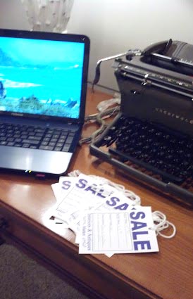
30% off sale in the shop at Interiors and Antiques

I have marked down selected items that, though I love them, it is time for them to find their forever home! You can find them at Interiors and Antiques in Vestavia Hills on Highway 31. My booth is number 6- Laurl Designs.

Fantastic tables, lamps, and vintage pieces are not 30% off, sometimes more, than the original price. It is time for me to move these pieces so that I can add new items for the holidays.


Here are some of the items just marked down!


Love this pair of tables!


Lovely tall black lamp with striking high end shade.                                        Great black shutter with ribbons for messages.

Great vintage bedside table or an end table! I love the pale moss green, of course it could easily be painted!

Saturday, September 21, 2013

before and after- the subtle houndstooth chair

The chair, detail.
I have always loved houndstooth, it is the overt preppy in me. However, living in Alabama... houndstooth takes on a different reference than preppy. I choose not to follow football, but living in Alabama, one cannot help but be influenced by the sport.  Sadly, I do not wear houndstooth much, especially in the fall, because people assume I have a football allegiance. And, no football fan wants to hear that you actively try to ignore their passion. However, sometimes houndstooth is subtle, perhaps un-noticeable to football fans... maybe.

The chair, after.
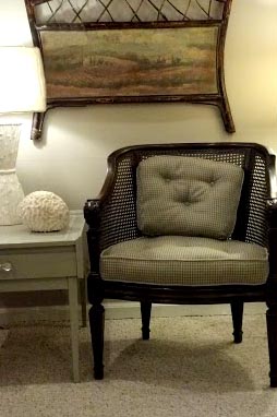
So when I found this fantastic houndstooth fabric in shades of french grey. I have to have it on as the upholstery on this chair. It is my latest furniture flip.
The chair, before.