meta name="p:domain_verify" content="83432fc69a1d6df071f49df584f9d839 Laurl Designs: color palatte
Showing posts with label color palatte. Show all posts

Friday, February 21, 2014

Color inspiration- the Grey and Bronze of Adelina Sotnikova's costume

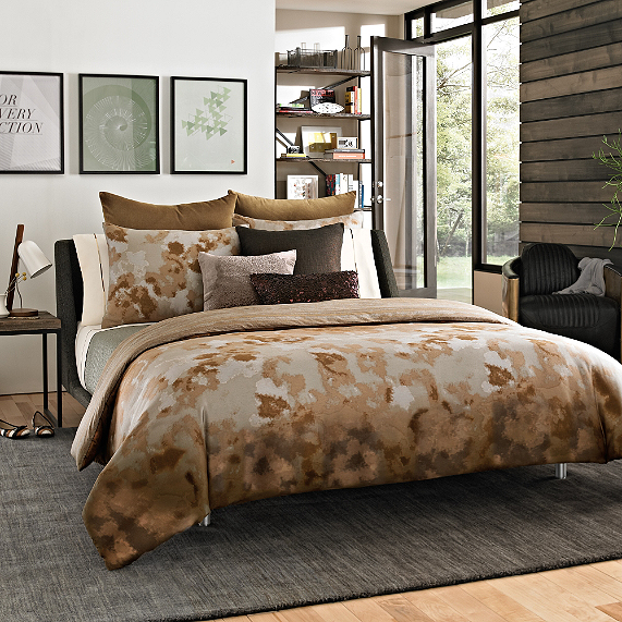
I love the combination of color on the Gold medal winner, in Ladies Figure Skating, free skate costume. Rich dark grey and warm bronze.... Matte grey and sparkle bronze... Pretty silk drapes and bronze hardware... Dark grey linen pouf with bronze nail heads... Soapstone counter tops with copper sink... I cannot decide how best to apply the combo!

Some inspirational riffs on that combo-
Here
IMG_8312
Here
Beautiful Kitchen area. Bronze and grey/.
Here

Here's one I want but have never seen feathers of.  Bronze-tailed peacock pheasant
Here

Grey, black white with bronze, gold touches
Here
Bronze hardware on grey cabinets; via FarmHouse Urban
Here
A medieval-looking chandelier and use of opulent bronze and gray velveteen give a rich-lush-castle feel to this beamed, cathedral-ceiling bedroom.
Here


Thursday, April 18, 2013

The next furniture flips! the tables

First, I was TOTALLY into chairs, now it's tables. By the end of this weekend, I plan to refinish and paint two side tables purchased from Scott's in Atlanta and finish my make-under project. As well as dwell on a table for a client.

Here's the line up!


This pair is going from medium wood tone with a gold finish to...
 
 
Or maybe a blue like this...

Then there is this treat of a bedside table... maybe a stain, maybe a paint job, maybe both! How cool would this be with the interior of the shelves painting a contracting color!


Friday, June 22, 2012

Neutral no more- adding color to your home interiors, part one

I recently had the pleasure of teaching a community school class on adding color to your home. I would love to share some of the information from my research here in a multi-part series.

With the help of my new best friend Olioboard.com, I was able to create this mood board to add color to a neutral room. Neutral spaces seem to be all the rage on home design TV shows, but they lack some zip in real life. In fact, studies show that your brain has a hard time distinguishing edges in a space where the colors are close together. By adding color to a space, you can break up the larger areas of the same color with visual interesting pieces.


Cool greys and creams can create a soothing space, but too much of a good thing it not always good! I have chosen a taupe, cream and teal color palette for this living room and created additional visual interest by adding elements in a lighter version of the teal. I choose to layer natural elements over room with the addition on tree form based table, faux bois drum table, sconces with a limb look, and bamboo look to the shelving as well as a floral pillow and pillow with nests printed on them. The formal sofa with the french lines is made fresh with the fabric and painted wood in a similar color. And though the space reads a modern due to the light teal pieces and the lines of the West Elm wing back chair, the space has classic elements with the sofa, patterned wall paper and classic lines of the storage piece. Because I love some sparkle on a space, I have add the Bourgie lamp from Design Within Reach. Want in item from this board or want to know more about it, just drop me a line at laurlself@gmail.com and we can chat!