"Bigger isn't better, Taller isn't braver, Stronger isn't always wise," a few thoughts from the musical Barnum. Though these lyrics refer to Tom Thumb from Barnum's circus acts, they can also pertain to design. In Sarah Susanka's Not so Big House series of books, she elaborates on how a home can be smaller and well designer where the owner doesn't need the size and space that the trappings of ego often influence in home decisions. With lowered ceiling in hallways, focal points, and datums, smaller spaces live large. Living smaller has another advantage of costs. Everything, including design is a balancing act, especially in budget. Living in smaller spaces allow one to spend more per square foot, if desired, or allows one to choose a few precious items to feature in the space, be it art, or a fabulous sink and faucet.
I just saw Sarah on an episode of This Old House, one of my favorite series from childhood. I was amazed that these guys could take a house down to the studs and bring it back different and better than before. I wanted to be able to do that to. I think that's why I care more about the making of a project, the design, how it works than seeing the end products. I do love the process. Of course, it is very important that the process produces your intent, or better, but the journey to the end can be a very rich dessert.

Laurl Designs offers curated interior design, DIY inspirations, and great shopping finds, all with an environmental awareness. As an interior designer, I blend styles and approaches to offer a curated design style to suit your needs.
Friday, October 23, 2009
Tuesday, October 20, 2009

Wednesday, October 14, 2009
Laurl's rule of thee-color theory
So often, you find something you think is beautiful, "perfect", or speaks to you and you want to buy it, but the color is so close to what is in the room, you are not sure if you are buying the exact color or something exactly awful. Many times this is a learned mistake. But all is not lost, when you employee Laurl's rule of three-color theory.
When you have two shades of green, let's say, in a room, you will often have a color issue. However, when you add the third shade of the color, it all seems to work. Color theory can, and should, go much deeper than this. But, for solving your color problem and making the purchase you loved in a store not go sour at home, it can be as easy as adding more, instead of subtracting!
When you have two shades of green, let's say, in a room, you will often have a color issue. However, when you add the third shade of the color, it all seems to work. Color theory can, and should, go much deeper than this. But, for solving your color problem and making the purchase you loved in a store not go sour at home, it can be as easy as adding more, instead of subtracting!
Monday, October 12, 2009
Bluff Park Art show shopping
 This year's show provided more woodworking than I have ever seen at the show, or any show in the area. It's like everyone got a lathe last Christmas. Not that there wasn't some lovely wood working, but oy vay was there a lot to choose from. Best part about all the wood workers, great dad gifts! I purchased from Bill Boyett of Gainesville Florida. His work included mostly boxes of exotic woods, however he had some beautiful letter openers. The letter openers are ergonomic in design and feel really good in your hand. And, any imperfections in the wood was inlaid with turquoise. Note the photo below, with the details of zebra wood and turquoise inlay. The second photo is on his show card. I wish he had had some of the letter openers that looks like the oak leaf on his card. They look lovely.

My other purchase was a beautiful mug. It is "replacing" a mug I bought years ago and broke from the same artist, Steve Loucks. It's obvious that his MFA was earned from the New York College of Ceramics at Alfred (a.k.a. Alfred), one of the best ceramic schools in the nation. Notice the matt glaze with the shine glaze underneath and the alligator like glazing on the handle. It's a beautiful high fired piece. Lynnette, Steve's wife who sold me the piece, informs me that all of his pieces are sanded smooth on the bottom, a very nice finish. And, a good indicator of quality. I like his mugs because many have light colored interiors, muck better to gauge the intensity of my coffee and tea. And, I can tell if they are clean... for two very pragmatic reason. For aesthetic reasons, the glaze choices are sophisticated. And the proportions are great. His other works can be found online.
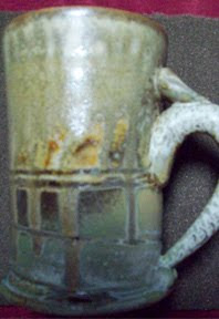

Ceramic purchasing tip: Always ask if the piece is high fire or low fire. High fire piece are stronger, the glazes are more durable and the pieces can be designed with thinner "walls". Important to know that lower fired works can be cheaper made and commonly craze in the glazing after a few uses and stain in the cracks. Good examples of low fire works come from shops like Bath and Body Works... cute, but poorly made.


Ceramic purchasing tip: Always ask if the piece is high fire or low fire. High fire piece are stronger, the glazes are more durable and the pieces can be designed with thinner "walls". Important to know that lower fired works can be cheaper made and commonly craze in the glazing after a few uses and stain in the cracks. Good examples of low fire works come from shops like Bath and Body Works... cute, but poorly made.
Please know that some mid-range and high fire glazes are designed to craze a part of the patterning of the glaze, but those will not cause you harm like cheaply made low fire pieces made in other countries. Really low fire pieces, like raku, are not designed to be functional, as in food safe. Many potters sell very low temp pieces (sometimes referred to as raku and pit fired) as dinnerware, but you should avoid it. Yes, people in ancient Japan used raku pottery to eat and drink from, but remember, as one point in European history, people used lead as a face powder. Those people died of lead poisoning. So, if you are not going to let your children chew lead paint and you're not going to install lead pipes for your drinking water, then don't buy raku to put food in.
Thursday, October 1, 2009
Twittering at Bluff Park Art Show
I'll be tweeting at Bluff PArk Art Show first thing Saturday morning. Follow me @bergerechair for the picks of the show, I'll be recapping on this blog later!
Subscribe to:
Posts (Atom)